4. The principle of color master-slave. When adjusting the color, we must start from the overall picture, emphasize that the color of the main part must be saturated, prominent, set off the color to be light, dark, can not divide the master-slave, arbitrarily adjust, but can not master and reversal.
When dealing with colors, it should be noted that the overall tone is related to the local colors. When adjusting the local colors, it should be closely integrated. When the color is set off at high speed, the relationship between the color and the subject color must be taken into consideration, and the normal proportional relationship of the colors must be maintained.
At present, the feature of gravure plate making requirements is to emphasize the accuracy of the subject color. Therefore, the accuracy of many electrical sub-pictures. Therefore, many electric sub-map colors and foreign disk graphics almost all need to adjust the local details, and some of the map colors should be individually adjusted out of the tick, so often pay attention to the subordinate color and ignore the main color, resulting in color The Lord never divides, even disregards the Lord. This is the simplification of the color processing of the current gravure packaging products, one of the low-grade aspects.
3 To analyze clearly the main color of a picture (the color of the main role), from the relationship between the colors (the color that sets off the role), the general rule is: the subject color is saturated, prominent, bright, set off the color light, virtual, dark Some of its role is to set off the main body. It must not be adjusted too dark, too fresh, too bright, and it must not be distracted. When there is a contradiction between the master-slave relationship dealing with color and the perspective laws, the principle of master-slave should be the main principle, and the master-slave relationship should be handled well, which is a must for high quality products.
5. Three-dimensional color processing. Merchandise packaging products mostly use photographic originals (reversal films, photographs, or digital photos, etc.). To correctly handle the relationship between light, objects, and shadows in photographic photographs, we must first deal with the light and shade relationship of the objects and the brightness and darkness of the three surfaces. Levels of display, highlight the three-dimensional object in the two-dimensional space on the photo screen, the three-dimensional display of the object image, depth and sense of space and environmental sense, which is to make the gravure package layer version of one of the important technical indicators . The processing method is as follows:
1 Correctly handle the light-dark relationship of objects. When using color to represent the bright part and the dark part of an object, we must maintain the light and darkness of the object when it shines. With light and dark contrast, the subject's sense of body can be lifted. The first method is that the basic color must have a change in depth and depth, and the basic tone in the tone cannot be darker than the dark tone. In this case, we must pay special attention to a problem. Since the external electronic image file adopts the GCR process, its black version replaces the complementary color, resulting in The basic color of the dark part of the object is reversed, that is, the basic color of the dark part is shallower than that of the basic tone of the middle tone. This lacks the basic primary colors of the dark production and the strength is not enough, so the middle part of the object cannot be supported. Therefore, it must be singled out to be deepened, to enhance the three-dimensional sense of the object. Secondly, the object's outline level and the contrast between light and shade are expressed by complementary colors. Attention must not be given to the complementary color of the dark part of the object, resulting in too bright and vivid colors. As a result, the light and darkness and three-dimensionality of the object are lost.
2 Correctly deal with the relationship between the amount of color and the amount of light. When adjusting the color, note that the color amount of the bright-tuning part cannot exceed the color amount of the middle-tuning part, the color of the middle-tuning part cannot exceed the color amount of the dark-toned part, and the ratio between the color amount of the color and the light amount level should be maintained. Don't just pay attention to the normal proportional relationship that loses color by emphasizing color and loses the three-dimensionality of the object, giving people a dull and uncomfortable feeling.
3 correctly handle the tone of the black version. Full use of the black version of the outline of the object's contours, to give up the three-dimensional sense of the object, the key is to handle the black version of the tone. Should be based on the short tone black skeleton, based on the original dark tone to adjust the size of the area, the appropriate extension of the black version of the tone, enhance the three-dimensional object.
6. The tone is processed continuously in this tone. The photographic photographs of food products, seeds, and other packaging products all have three major aspects: the bright tune, the middle tune, and the dark tune, and the hue adapts naturally to each other, with a continuous transitional tone, and the art of gravure printing Always increase the contrast between the two sides, that is, the highlight is easy to light and the dark tone is easy to deepen, resulting in a distorted tone, that is, loss of tone on the light tone meter, light tone in the middle tone, deep tone tone and excessive level, resulting in hard mouth without continuous overshoot Toned. Therefore, it is important to grasp the following processing methods.
1 First of all, understand the relationship between the three major surfaces of each object and the continuous transition of its hue, and adjust the image contrast within the gravure printing range.
2A. Connect the tone of the tone with the tone of the bright midtones naturally, deepen the light tone of the highlight area, and make the transition between the light tone and the bright tone natural. B. The basic tone of the first tune and bright tone, and the second is to maintain a continuous transition tone with the deep tune.
3 The key technology to handle the continuous transition color tone lies in the adjustment of the main color version, that is, the warm-colored M-colored version, the cool-colored C-colored version, and the relationship between the three major surfaces and the harmonious and uniform color tone. Full color, soft coordination. At the same time, we must also pay attention to the black version of the continuous transition tone, the key is to do gradient wind, in the network and out of network and 75% to 90% of the area to be transitional natural.
7. Color jump area processing.
1 Handle the color of the 80% dot jump area. According to the rules of gravure gravure printing roller dot and OPP film proofing and printing dot enlargement, as the tone is deepened, the dot gain and the depth of the cell hole change simultaneously, and the dot gain increases linearly with the percentage. The darker the tone, the more it increases. The 80% area is a jumping area where the outlets turn, and more than 80% of the outlets increase in straight lines. The color hierarchy is easy to merge. The 80% or less outlets are more moderate, and generally can be printed out. as shown in picture 2. Therefore, here we must pay attention to the essentials of a color process. The basic colors, such as the basic red color, should be separated from the complex color of the dark color and the color values ​​of the dots in the 80% to 85% area. Diminish the dark tone's complex color to less than 80%, from 75% to 78%, to avoid 80% of this dot jump zone. As (Figure 3) method.
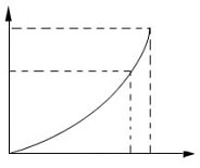
figure 2
image 3
On the one hand, it can ensure proofing, and it can be printed with red real colors. On the other hand, dark colors, browns, and other complex colors can be neither reddish nor red, and they can achieve the best of both worlds.
2 Handle the color of the 5% dot jump zone. According to the rule that the engraved cylinder is easy to lose small dots and the effect of high light adjustment is thin, the pattern of OPP film proofing and the poor dot transferability during printing are inconsistent, and the following 5% small dots generally cannot be transferred to the machine, and the amount of light that affects high-light and light colors is insufficient. , and easy to merge with the extreme high light part of the network. Therefore, we must consciously deepen the basic colors of high light to avoid 5% of this network jump area, both to ensure high light tone full color, but also make high light light colors do not appear hard mouth, disconnected, rough defects, handle well The color of the two dot-hopping zones is two tricks to improve the quality of gravure-printed color gradation products.
Author: Yanyou Fang Source: World Printing
About Our Office Training Table
Office training Chairs are specially designed chairs that are used in office training rooms or conference rooms. These chairs are designed to provide comfort and support for individuals who are attending training sessions or meetings for extended periods of time.
Office training chairs typically have a padded seat and backrest to ensure comfort during long hours of sitting. The seat is often adjustable in height and may have a swivel mechanism, allowing users to easily move and turn around. Some chairs also feature armrests for added support and comfort.
These chairs are usually made of high-quality materials such as leather, fabric, or mesh, which are durable and easy to clean. The frames are often made of metal or sturdy plastic to provide stability and longevity.
Office training chairs are designed to be ergonomic, meaning they are built to support proper posture and reduce strain on the body. They often have lumbar support to promote a healthy spine alignment and may have adjustable features such as tilt tension and backrest angle.
In addition to comfort and functionality, office training chairs also come in various styles and designs to match the overall aesthetic of the office space. They can be found in different colors, patterns, and finishes to complement the office decor.
Overall, office training chairs are essential furniture pieces that prioritize comfort, support, and functionality for individuals attending training sessions or meetings in the office environment.
Office Training Chairs,Training Study Chairs,Plastic Training Chair,Metal Frame Training Chair
Henan Toda Technology Co., Ltd. , https://www.httofficefurniture.com